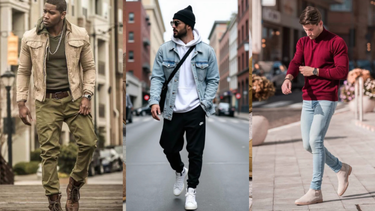
Color Combinations Every Man Should Know Before Getting Dressed
Most men dress by elimination. You rule out the things that clearly don’t work and go with whatever’s left.
It’s not a strategy, but it functions — until the day you pull on a burgundy shirt with khaki trousers and brown shoes and stand in front of the mirror wondering why it looks wrong even though nothing is technically broken.
The answer, almost always, is colour. Not individual colours failing — the relationship between them.
Colour combinations for men don’t require a design degree or a colour wheel on your bathroom wall. They require a small set of reliable pairings that you understand well enough to apply instinctively.
Once you have maybe eight to ten combinations internalised, getting dressed stops feeling like a guessing game and starts feeling like a decision. That’s the shift this article is designed to make.
Below are the colour pairings that actually work — the reliable ones, the surprising ones, and a few that most men haven’t thought to try.
Learn these, and you’ll pull outfits together faster, with more confidence, and with results that hold up across seasons.
The Reliable Foundations
1. Navy and White — The Combination That Invented “Smart Casual.”
There’s a reason this pairing has been reliable since at least the nineteenth century. Navy absorbs light without being as severe as black; white reflects it without being as stark as silver or pale grey.
The contrast is high, but the tones are clean, which means the outfit reads as crisp regardless of what pieces you’re using. Navy chinos and a white Oxford. White tee and navy slim trousers. Navy blazer and white linen shirt.
The format is infinitely flexible; the pairing always delivers. The only failure mode: if the white is dingy or the navy is faded, the contrast that makes the pairing work disappears. Keep both clean.
2. Grey and Navy — The Most Wearable Two-Colour Combination in Men’s Wardrobes
Grey and navy together is the closest thing menswear has to a guaranteed outcome. Both are cool-toned neutrals, but navy has depth and grey has breadth – together they create a palette that reads as authoritative without being aggressive and casual without being lazy.
Mid-grey trousers with a navy knit. Charcoal jeans with a navy overshirt. Navy coat over an all-grey outfit underneath. Any combination works. The only real decision is proportion — which colour leads, and which supports.
This is the pairing I recommend to clients who are rebuilding a wardrobe from scratch. It’s the most forgiving combination to learn on.
3. White and Camel — The Warm Neutral Pairing Most Men Haven’t Tried
White gets paired with navy, grey, or black almost automatically. The more interesting move is white with camel or tan — warm neutrals that bring out the subtle warmth in white that cool-toned pairings suppress.
A camel rollneck with slim white chinos. A white linen shirt over camel trousers. The palette reads as clean but warmer, more Mediterranean, and less corporate.
It works particularly well in spring and summer and photographs beautifully in natural light. Try it once and the navy-and-white default starts to feel less necessary.
4. Black and White — Correct Only When the Fit Is Doing the Work
Black and white together is technically a high-contrast pairing that should always look clean. In practice, it often doesn’t — because the starkness of the combination means any fit issue or fabric problem immediately reads as louder than it would in a softer palette.
This is the combination where you need the fit to be genuinely good. Slim black trousers, white tee, clean white trainers: excellent.
Baggy black jeans, oversized white tee, worn white rubber-soled trainers: significantly less. When it works, it’s one of the sharpest palettes in casual menswear. When it doesn’t, it reads as student wardrobe.
5. Olive and Cream — The Earthy Pairing That Feels Like It Was Always Right
Olive and cream together have a warmth and earthiness that makes the combination feel natural rather than constructed. Cream chinos or trousers with an olive overshirt or jacket. Olive trousers with a cream or off-white knit.
The palette works because both tones draw from the same earthy, warm end of the spectrum — they’re harmonious rather than contrasting, which gives the outfit a relaxed, considered quality. This combination works across every season but hits hardest in autumn and spring.
It’s the outdoor-lunch outfit, the weekend market outfit, the casual-dinner outfit. Versatile without being boring.
The Bold Pairings Worth Knowing
6. Navy and Burgundy — The Colour Combination That Punches Above Its Weight
Navy and burgundy is one of the richest pairings in menswear and one that’s consistently underused by men outside of traditional prep dressing. Burgundy — specifically a deep wine or oxblood rather than a bright red — adds warmth and depth against navy in a way that white or grey can’t.
Navy blazer with a burgundy knit underneath. Burgundy chinos with a navy shirt. Navy overcoat with burgundy scarf.
The combination works because both colours carry a similar tonal weight — neither is bright, neither is pale — and the contrast between blue-green and red creates a richness that feels effortless rather than matched. [link to related article on navy blue outfits for men]
7. Olive and Rust — The Autumn Pairing That Gets Compliments
If there’s a combination on this list that surprises people who try it for the first time, it’s olive and rust. Both sit in the warm, earthy part of the spectrum — olive’s muted green against rust’s orange-red — and together they create an autumnal palette that looks seasonally considered without being obviously themed.
An olive overshirt or chore coat with rust chinos. A rust knit with olive cargo trousers. The combination reads as fashion-aware without being fashion-forward, which is the sweet spot for most men.
This is the outfit that earns comments and is easy to execute.
8. Camel and Grey — Warm Meets Cool, and It Works Beautifully
The contrast between warm camel tones and cool grey is subtler than navy-and-white but arguably more sophisticated. A camel overcoat over a grey suit. A grey crewneck with camel trousers. Grey slim jeans with a camel knit jacket.
The palette is distinctly grown-up — warm enough to feel inviting, cool enough to feel serious. This is the combination that reads as genuinely considered, the kind of thing people see and register as “he knows what he’s doing” without being able to explain exactly why.
The key: grey should almost always be the darker of the two tones.
9. Brown and Pink — The Combination More Men Should Try
Hear me out. Dusty or muted pink — not fluorescent, not pastel, but a subdued rose or clay tone — against brown creates a surprisingly natural pairing because both draw from warm, organic pigments. A mid-brown or tan jacket over a dusty pink shirt.
A brown leather belt and shoes with a rose-pink chino. The combination reads as deliberately colour-aware but never as overtly trendy, because the muted tones keep it grounded.
Men who make this combination work tend to wear it with confidence — which is, honestly, half of what makes it land.
PRO TIP: Every colour has a temperature — warm (red, orange, yellow, brown, camel, rust, olive) or cool (blue, grey, purple, black). Outfits that stay within one temperature range almost always work. Outfits that cross temperature intentionally and boldly can be striking. Outfits that mix temperatures accidentally almost always look wrong. Before you get dressed, ask yourself: are my colours warm, cool, or am I crossing the line on purpose? That one question will fix more outfit problems than any other piece of style advice.
10. White and Terracotta — The Summer Combination That Feels Current
Terracotta — a warm burnt orange-red — paired with white is a combination that’s been sitting in the zeitgeist for a few seasons and shows no signs of leaving, because the underlying colour logic is sound rather than trend-driven.
White and terracotta sit at opposite ends of the warm spectrum and the contrast between them is vibrant but never harsh. White linen shorts with a terracotta camp collar shirt. A terracotta knit with white slim trousers.
White trainers with terracotta chinos. This is warm-weather dressing with genuine colour confidence, and it works across a wide range of skin tones particularly well.
Read also: Men’s Trench Coat Outfits: Old Money Look for Every Season
The Neutral Mastery Combinations
11. All-White as a Summer Uniform — With One Textural Variable
All-white as a complete outfit is a move that most men avoid because it seems high-maintenance. It can be, if the fabrics are wrong. The trick is making texture do what colour can’t: a white linen shirt with white cotton shorts creates a variation in fabric surface that stops the outfit reading as a uniform.
Add a tan leather sandal or beige trainer at the foot to anchor it. This is a summer resort or holiday outfit that reads as effortlessly intentional, and it’s far easier to maintain than it looks — linen and cotton both wash well and the slight wrinkle only adds to the effect. [link to related article on all-white outfits for men]
12. All-Black Done Right — When Contrast Comes From Texture, Not Colour
All-black is the combination most men resort to as a default, and it works when the textures are varied: a matte cotton tee, a leather or waxed cotton jacket, slim wool-blend trousers, and a suede or leather shoe.
The variety of surface textures — matte, sheen, nap — creates visual interest within a zero-colour palette.
Where all-black fails is when every piece has the same weight and finish, and the outfit reads as flat or shapeless. When it works, it reads as deliberate and fashion-forward. The one rule: your blacks need to be similarly dark.
Faded black jeans against a deep black jacket reads as colour clash, not monochrome.
13. Grey and White — The Coolest of the Neutral Pairings
Grey and white together is the cooler, less corporate alternative to navy and white. A white tee with mid-grey slim chinos and white trainers. A grey lightweight overshirt over a white tee with white shorts in summer.
The palette is clean, cohesive, and easy to wear without overthinking. The one thing it requires: the grey needs a clear identity — light, mid, or dark. Ambiguous grey that reads as dirty white undermines the pairing. A clear mid-grey or charcoal against white is clean and modern; a murky in-between shade isn’t.
14. Charcoal and Camel — The Winter Pairing That Feels Expensive
Charcoal and camel together is one of those combinations that registers as expensive-looking even when the pieces themselves aren’t.
The depth of charcoal against the warmth of camel creates a contrast that feels considered and seasonal, particularly in autumn and winter. Charcoal slim trousers with a camel rollneck.
A camel overcoat over charcoal jeans and a charcoal knit. Charcoal and camel work together because they hit the same tonal weight — both are medium-dark in their respective temperature ranges — and the warm-cool contrast is balanced rather than harsh.
The Surprising Combinations That Earn Double-Takes
15. Navy and Olive — The Combination Hiding in Plain Sight
Navy and olive is one of the most underused pairings in menswear given how naturally it works. Both are serious, grounded tones — navy from the cool end of the spectrum, olive from the warm side — and their contrast is subtle but distinct. An olive overshirt over a navy tee. Navy chinos with an olive jacket.
A navy overcoat over an olive knit and dark trousers. The combination reads as thoughtfully considered, and because neither colour is loud, the pairing tends to attract “that works really well” comments from people who can’t quite name why. [link to related article on ways to wear olive green without looking military]
16. Rust and Slate Blue — The Unexpected Pairing With a Natural Colour Logic
Rust or terracotta against a cool slate or dusty blue creates a contrast that looks like something lifted from a natural landscape — which is exactly why it works.
These aren’t complementary colours in the strict colour wheel sense, but they sit at similar tonal weights on opposite temperature registers, and the contrast between them feels balanced rather than jarring. A rust knit with slate blue slim chinos.
A slate blue overshirt with rust cargo trousers. This is a combination that looks more adventurous than it actually is — try it once and the logic immediately becomes clear.
17. Cream and Chocolate Brown — The Tonal Contrast That Ages Well
Cream and chocolate brown together is one of menswear’s better-kept secrets. The warmth of both tones creates a natural harmony, but the depth contrast between a near-white cream and a deep chocolate brown gives the pairing real visual impact.
Chocolate brown wide-leg trousers with a cream crewneck knit. A cream linen shirt with brown leather trousers or cord trousers.
The combination reads as timeless rather than trendy — it’s appeared in quality menswear for decades because the underlying colour relationship is fundamentally sound. This is the autumn-into-winter combination that never looks dated.
18. Stone and Navy — The Smart-Casual Uniform for Warmer Months
Stone — a greyed-out sand or warm off-white — against navy is a slightly more interesting alternative to white-and-navy and worth understanding as a distinct pairing. Stone chinos with a navy knit or overshirt.
A stone linen jacket over a navy tee. Navy shorts with a stone or natural linen shirt. The warmth in the stone tone softens the contrast against navy compared to white, giving the combination a relaxed, coastal quality that white-and-navy’s crispness can’t replicate.
This is the warm-weather smart-casual combination that requires no thought and always lands well.
The One Thing That Ties Every Combination Together
Colour combinations don’t work in isolation — they work because of fit, fabric, and proportion. A perfect colour pairing in poorly fitted clothes still reads as an afterthought. And a slightly imperfect colour combination in well-fitted, well-textured pieces often reads as considered and sharp. Colour is a multiplier: it amplifies the quality of the dressing underneath it, in both directions.
Take two or three of these combinations and make them yours. Learn them well enough that you apply them without thinking. Then add the next. That’s how a wardrobe builds real coherence — not by buying more pieces, but by understanding the relationships between the ones you already own.
Which of these combinations are you going to test first? Drop it in the comments, or save this for the next time you’re standing at the wardrobe wondering what goes with what.
Read also: